The tone of voice we use, the messages we send to our recipients, the particular words we choose to express our emotions – all this form effective verbal communication.
It is safe to assume that most of us don’t even reflect on the word selection or the tone of our messages, at least not on the conscious level. However, we process the messages we receive, and what’s more, they influence us, our behavior, and our choices.
I’m not going to bore you here with Jakobsen’s communication functions or other language theories that have influenced modern linguists up to the present day. Instead, I will tell you how to improve your digital product with communication. And the area that touches most broadly on this topic is called UX writing.
So today, I’ll take you through the essentials of UX writing. I’ll tell you what exactly UX writing is, how to prepare an impactful copy for your digital product, and, even more importantly, how to engage with users through clear and smooth communication.
What exactly is UX writing?
UX writing is the area of User Experience design that focuses on providing smooth, easily understandable, effective, and engaging communication with users. Here, UX writers use techniques to design the perfect content that users will see whenever they interact with a digital product.
This UX design area is directly tied to content strategy and should be an inseparable part of it. For that reason, whenever you define your buyer personas (based on thorough user research), establish the tone of voice or map your content, you should always have the principles of UX writing in the back of your head.

Importantly, the UX writing process consists of designing both microcopy and macrocopy. The main difference between these two types of content comes down to the length of copy. While microcopy consists of only small parts of informative texts that should guide users and help them do things within the digital product, macrocopy involves much longer and more descriptive forms of content.
The table below summarises the most common examples of microcopy and macrocopy:
| Microcopy | Macrocopy |
|---|---|
| Buttons | Articles |
| Forms | Instructions |
| Error text | Product description |
| Comfirmation message | Category description |
| Link text | Press release |
| Menu options |
The important thing to remember is that UX writing consists of practically all types of content you can find in a mobile app or website and is not limited solely to button texts of 404 error messages. UX writing goes far beyond that!
At Miquido, we know that UX writing has immense power. For this reason, it is one of the inseparable elements of our User Experience design services.
Words have exceptional power. Even one poorly chosen word or phrase can stop a user from performing the desired action. And this, in turn, will affect all other business results. Therefore, UX writing is one of the key aspects that influence the usability of a product and should not be ignored in the design process. Seemingly simple, small words can bring significant results.
Why is UX writing so important?
Whether you work on improving your website’s performance or want to provide the smoothest experience for your app users, you should always pay attention to the power of UX writing and make it an essential part of your strategy. Why is that? For several reasons:
- You streamline communication with users. With the right content in your digital product, you can make communication way smoother and more effective. What’s more, you add a human touch to your messages and build a strong bond between you and your users.
- You add uniqueness to your product/brand. An out-of-the-box copy on your website or mobile app (or actually, wherever you are trying to reach your target audience) can help you stand out from the crowd and get into the minds of users.
- Your product’s retention rate can reach new heights. Perfectly-tailored communication that prompts users to keep interacting with your app or website will make them want to keep returning to your product instead of rushing toward your competitors. So, if you want to boost your retention rate in no time, UX writing may contribute greatly to this.
- You achieve greater business results. By providing only relevant and clear messages, you boost interactions with users leading them all the way through to completing the required action. This will consequently lead to achieving considerably greater business results and reaching more revenue. After all, that’s what you’re aiming for, right?
As you can see, excellent copy can do wonders for your digital product, which can also translate into achieving business success. So, if you’d ask me whether investing time and energy into creating the perfect copy is worth the effort, my answer will always be YES!
10 rules for creating effective UX writing
Now that we’ve passed the (no less important!) theoretical part, let’s move on to the fun part, which is preparing the perfect copy for your product. Here, I’ll share some pro tips for effective UX writing that will engage and delight users.
1. Use plain language
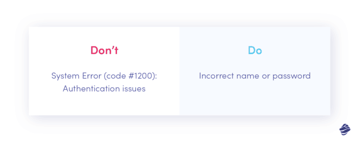
Here’s a safe bet: at least once you’ve had in your hands an overly complicated official note that was just impossible to comprehend, even if you attempted to read it over and over again. Try to recall how frustrated you felt at that exact moment. And this is a feeling you should never evoke in the user when interacting with your product.
When creating simple copy, you should keep the following in mind:
- Opt for easily understandable vocabulary. Sometimes it’s tempting to use some creative flourish of words. And while in most cases it’s not a bad thing, the button text or navigation are not the best places to get carried away by your limitless creativity.
- Explain difficult things with simple words. Remember that your copy is written for humans, not for robots. Users should always feel that they fully understand your messages, no matter how complicated the topic is. Here, I’ll leave with the words of Albert Einstein: ”If you can’t explain it to a six-year-old, you don’t understand it yourself”.

2. Always stay consistent
When interacting with your app or browsing through your website, users should never feel lost and confused. And unfortunately, they will if you don’t ensure that the whole copy is consistent.
What do I mean by that? Let’s say that for buttons inviting people to start the registration process, you always select Register for the entire application. But on one screen, intentionally or not, someone put Sign up. Even such a minor change can cause some confusion and irritate users.
That’s why preparing a content style guide for your company is essential. And what exactly is a style guide? Simply put, it is a set of rules regarding writing and formatting compiled in a document. This way, anyone who creates copy for your product or optimises certain elements will know what rules to follow to keep things consistent. Take a look at the examples from Apple or Material Design from Google to see how a good style guide should look.

3. Make your microcopy concise
As even the name itself suggests, microcopy should always stay micro. There is no point in adding unnecessary words to a header or menu for no particular reason. You won’t impress anyone with this and, worse still, you’ll make your copy less efficient. And that’s definitely not the effect you should achieve.
Keep in mind that digital products come with some constraints that directly impact copy. For example, since mobile devices have relatively small screens, it’s crucial to adjust microcopy to this restriction. What’s more, users tend to scan websites instead of reading the full content back and forth. A short, to-the-point copy can be more powerful than an overly long sentence.

4. Be useful
To make the copy perfect, you need to understand who you are creating it for and what expectations your digital product should meet. This way, you will know exactly what users need, allowing you to deliver valuable and helpful messages.
So try to put yourself in the user’s position and ask yourself whether a particular piece of information or message will help the user in some way. If the answer is ‘yes’, you’re good to go with it. Otherwise, you would fill the product with irrelevant and useless copy, losing the essence of your message.
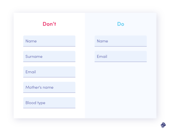
Also, ask for the data you need. Do you want users to fill in your contact form? Only request the information you absolutely need. Too many fields will discourage users from submitting the form.

5. Be conversational
People are not robots. It should go without saying, right? However, some still tend to create content that seems like robots wrote them for robots. And what for? After all, reading a dehumanised text is certainly not enjoyable for anyone.
Instead, opt for more conversational copy, interact with the user, start a conversation, use active voice, be helpful. Choose a more human-like language, as this will definitely evoke more trust in your brand.

6. Stay inclusive
No one should ever feel excluded. And not only in digital products but generally in life. We can’t fix the world by ourselves, but what we can do is teach others by example. And your app or website is the perfect place to show that you care about every single user.
So, what can you do to make copy more inclusive?
- Avoid using only masculine pronouns as this way, you exclude all the female users. Using gender-neutral pronouns ( ‘they’ instead of ‘he’ and ‘she’) or going with ‘you’ will be a much better option.
- Use universal phrases. Referring to culture-linked phrases that only selected users will know shouldn’t be your top communication strategy. Also, don’t overuse jargon (I discuss this in more detail below), idioms, or less common acronyms. Simply put: don’t make users have to consult dictionaries every time they open your app.
- Adopt person-first language when possible. Put users in the very center of their actions. Moreover, describing them use phrases like “a person who…”, “people who…”

7. Avoid jargon
As already mentioned, simplicity is a ground rule that every skilful UX writer should remember. The content you create should be clear and understandable to all users, not just to a selected group who will manage to decode the technical jargon language.
Surprisingly, this rule may be challenging for many to apply. Why is that? Because quite often, we live in our bubble. We have expert knowledge in a particular field, reassuring us that others also possess such expertise. And we couldn’t be more wrong. That’s why users are swamped with incomprehensible manuals, complex guides, or unhelpful reports. Bearing that in mind, try to put yourself in recipient’s shoes and prepare non-jargon content tailored to all users.

8. Use numerals
If possible, try to replace words for numbers with numerals. They take up much less screen space and, more importantly, numerals as a rule tend to be easier to remember and much faster to read.
However, even with how you write down the numbers, the consistency rule is dominant. For instance, if you establish that single-digit numbers should be written in words or that the number that begins a sentence should not be written numerically, always stick to this rule.

9. Avoid creating long blocks of text
As I have already mentioned, users are more likely to scan your content than read every little piece of it thoroughly. They skim websites looking for some valuable and relevant information.
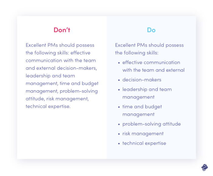
For that reason, including long blocks of text may hinder users from finding what they are looking for. By dividing the text into shorter sections, you can make it more scannable and more pleasant in its reception. Here, using some structural elements can be pretty helpful. So try to divide content by including headings, subheadings, lists, bullet points, columns, tables, graphs, and other graphic elements.

10. Be creative
With excellent UX writing, you can provide a delightful experience in every single microinteraction with a digital product. And I don’t just mean providing an awesome copy for buttons or preparing flawless forms. UX writing can go far beyond that.
Add a dash of creativity even on screens that may seem just dull. Surprise users with a clever 404 page or give an interesting fact about red pandas (they’re so cute, check them out!) to make a lengthy installation process more pleasant. The more creative you get, the better impression you can make on users.

UX writing fundamentals: final thoughts
Even though some still find it hard to admit or ignore it, it’s time to say it loud and clear:
Words have immense power and can profoundly impact users, even on a subconscious level. For that reason, UX writing should become an integral part of your design process.
My message for you is this: invest some time and effort into writing and optimising micro- and macrocopy of your digital product. So make your buttons, manuals, instructions, forms, headings, and other forms of content as valuable, perfectly-targeted, unique, and enjoyable as possible. And believe me, your efforts will be rewarded in the long run.
If you’d like to take this UX design process off your shoulders – hire our dedicated UX writers. Our design team, with excellent writing skills, will create a user-centred and fully functional digital solution tailored to your customers.


