Do you remember your first walk on ice? Let me refresh your memory. With great curiosity and child-like joy, you stepped on the surface of frozen water. Maybe it was just a spontaneous move or you expected a brand-new experience. As you were moving, you probably felt a surprisingly pleasant slide. With every additional move, you had even more fun and wished the winter would never end.
There is nothing like the first time.
Hold on for a second. You could have had an uncontrolled crash and ended up with an aching backside. To make it worse, there were other children who made fun of you and you felt cold because of your lack of gloves. You never want to go back there.
People are very sensitive to their first experiences. Without redundant analysis, we simply rate something as “good” or “bad”. Sometimes it takes a long time before we change our minds. Long story short, our response to first experiences isn’t so different when it comes to digital products. Disappointment, frustration, boredom — what else can go wrong? That's why user experience services are essential for your digital product development.
FTUX in digital products
First Time User Experience (FTUX) is the first journey people take with your product. It begins from the very first interaction a user has with your brand, like a post on social media or recommendation from a friend. In the perfect scenario, the journey ends when the user reaches the “Aha” moment — a point when they understand the core functionality and believe that the product will improve their life.
Simply put, FTUX sets the user-product relation, but also can superpower the business and determines whether your users will be retained or churn.
Good practices for FTUX
- Value first 💘 Users don’t care about features, they care about how it will make their lives better. Show them the value they can get.
- No explanation ⏱ No one has time for trying to understand what the product can offer. Let the user do something instead of telling them how to do it.
- Progressive disclosure 🧠 People feel overwhelmed when they get too many options or complex functionality. Give them only a taste of what the product can offer. Let them discover more naturally.
- No friction 💥 Reduce effort to a minimum by using common patterns, pixel perfect UI and flawless flow. A small detail can make a big difference.
- Engagement 🚀 Activate your users and show them what they can do next. Keep them engaged so they don’t feel bored or pointless.
- Trust 🎖 Be careful about permissions and sensitive information, especially if people don’t recognize your brand. Build trust instead of privacy concerns.
- Delightful moments 🎁 Add any celebration, micro-interaction, funny illustration, animated loader, or smart UX copy, to give a little pleasure or unique feel.
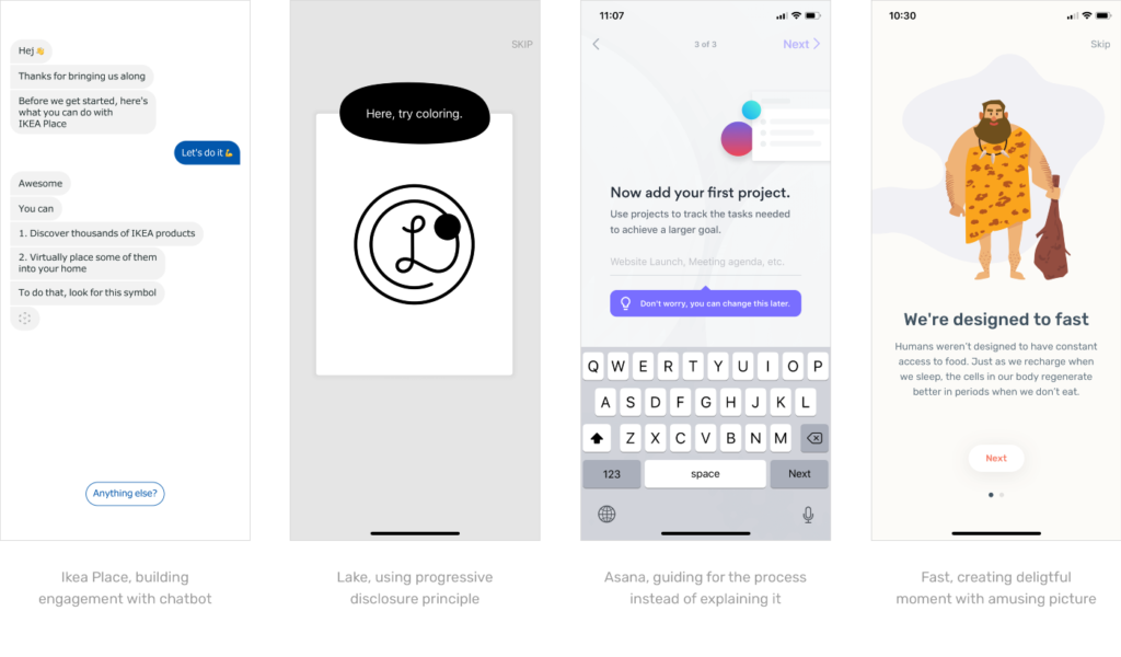
If you want to learn more about FTUX I recommend this comprehensive guide from Intercom.
But gaining knowledge is one thing. What I find more challenging is how to use the potential of the product and apply this knowledge to design a delightful journey that will keep people sticking around.
Our story
For some time I’ve been working on a mobile app for one of our startup clients. I ran several UX workshops, defined the exact scope and was working on the onboarding. It seemed that we all had a clear vision of what it should look like — a nice first tutorial, standard login, and account setup.
I’ve never perceived user onboarding as something particularly challenging, and so I easily prepared complete wireframes. There were, however, a few things that bothered me at this point.
Value proposition
- How do users get the most from our app in just a few minutes?
- What are the most important values we want to promote?
- How can we show the social value of an app that has few users?
Flow
- When do we inform users about specific features?
- How can we minimize the number of steps in onboarding?
- Do we need a screen “Find friends from Facebook” in the first app session?
Design
- How can we make the onboarding immersive enough to keep users exploring?
- Should we use pictures, app components or illustrations?
At that point, I could have moved on to the design phase, though I felt obliged to share my concerns with the team and try to solve them. That’s why I designed a special workshop which aimed to create a strategy for first-time user moments in the app.
Before I introduce you to our approach, let me answer three common questions that may come to mind at the moment.
What do I get from a UX workshop?
A workshop helps you examine the first-time user experiences in your product. By empathizing with your users, you will have an opportunity to better understand their perspective and the challenges your product faces. Additionally, you will define the FTUX strategy and the “Aha” moment.
Ultimately, you will improve the first-time user journey, maybe come up with a way to simplify the flow or make the onboarding more fun. Ideas that frequently pop up during such workshops often serve as triggers for further steps in product development, such as usability testing, data analysis, and content strategy.
When do I need to run a UX workshop?
In our case, we ran the workshop during the product design phase, before launching a new mobile app. If you already have the product (web or mobile apps), you can run the workshop as a way to empathize with your users or to further evaluate feedback from user testing in an FTUX context.
Who should attend?
Invite people who can help answer questions and have the authority to make the necessary decisions. Our workshop members included a Founder, CEO, Product Manager and another Designer. Each of these people came from a different background and specialty so that we could look at the problem from different perspectives. In the end, the workshop team demonstrated the same level of understanding, and I, as a designer, could propose more satisfying solutions.
First Time User Experience Workshop
Goal: Improve the First Time User Experience
Time: 4h (inc. 10 min break)
*approximately, can vary depending on the product and needs
Attendees: 4 people involved in a project + facilitator
Agenda
- Introduction
- Empathise: Black Hat Thinking
- Define: Value Proposition & Strategy
- Create: FTUX Journey
- Wrap-up
Before you start
- Research for best practices. At this point, you should have basic knowledge about FTUX, be familiar with good patterns and solutions of your competitors. It is worth having this knowledge and going beyond its spectrum.
- Educate your teammates on FTUX and why it is so important. Send them some materials so they can get familiar with the subject.
- List all your concerns. This will help you focus on product needs, as well as customizing your workshop to meet them. Set your goal for the workshop and go for it.
- Work on your facilitator skills (if you will moderate the workshop). Think about how to explain and run the exercises. What I find useful is a short presentation, where I display the key points. It helps to gain your team’s attention to what is going to happen. If you do not feel confident as a facilitator, use ready-made tips like model for conducting UX activities from NNgroup.
- Conduct a workshop pilot to check if the methods work and how long they will take. Sometimes even a short talk with a colleague allows you to pick up some important fixes.
- This workshop was conducted in-house. If you cannot gather all participants in one place, check out this handy guide on how to conduct remote workshops.
Introduction
5 min | no additional tools required
At the beginning, utilize a good lightning talk. Briefly explain why you all gathered, what issues you encountered and would like to share, why you decided to run the workshop. Then remind everyone about the goal and how participants can help to achieve it. Lastly, present the workshop plan and detail break times. A good introduction should be efficient and insightful. It can significantly help to gain your attendees’ attention and engage them from the very beginning of the workshop.
👉 Tip: If it’s your first workshop with this team, spend additional time to work out a workshop contract that will set up the communication rules. You can also run a quick warmup so the participants feel more comfortable in the group.
Empathise: Black Hat Thinking
15 min | sheet of paper, whiteboard, timer
Black Hat Thinking is a method that aims to indicate potentially negative outcomes. To perform this exercise, introduce a short user scenario. It helps to empathize with new users.
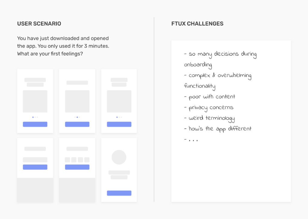
Ask attendees to think individually about any negative feelings a user may have. After a few minutes, ask everyone to present their concerns. At the same time, write all of them on the board. Thanks to this exercise you will get the list of FTUX challenges that you will probably have to deal with. With that in mind, you can go to the next part.
👉 Tip: To remind participants of the flow, prepare the current screens. You can put them on a sheet with the user scenario, print separately or provide devices with the app.
Define: Value Proposition & Strategy
20 min | sticky notes, whiteboard, voting dots, timer
I start each exercise with a brief explanation of the method and the purpose. “People don’t buy a product, but a better version of themselves” — this popular phrase perfectly explains what it is all about. If you already know the value proposition for your product, it’s even better. You can examine it now in the context of FTUX. To do so, ask your attendees four questions:
- What will make users’ lives better? (Value)
- How do we stand out from the competition? (Advantage)
- What are the most important features? (Functionality)
- How can we create an outstanding FTUX journey? (Strategy)
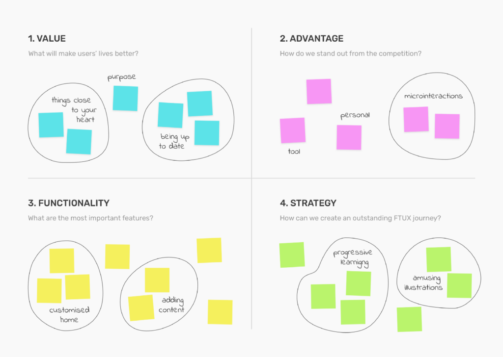
Next, ask people to put their sticky notes on canvas and present their thoughts. Take some time to agree on each of these four aspects. Maybe you will need to choose the best value, sort out notes in the strategy area. Once we know our challenges and have an agreed strategy, we can start creating the FTUX journey.
👉 Tip: It may occur that you have many ideas and need to choose some or prioritize them. In this case, dot voting can work well.
Create: FTUX Journey
50 min + 10 min break | sticky notes, whiteboard, timer
This exercise requires the most time and contains three parts. At the beginning, you have to determine what the “Aha” for your product is. This is the moment when the user makes some investment that will probably make him want to come back. For example, it could be observing three people or adding a post. It is the final point of the journey we aim for.
Once you have an “Aha” moment defined, ask each person (or groups) to work on the most accurate FTUX journey. It’s all about mapping out every step the user takes through the flow. Include steps that require leaving the product, for example, to receive an email or use a card.
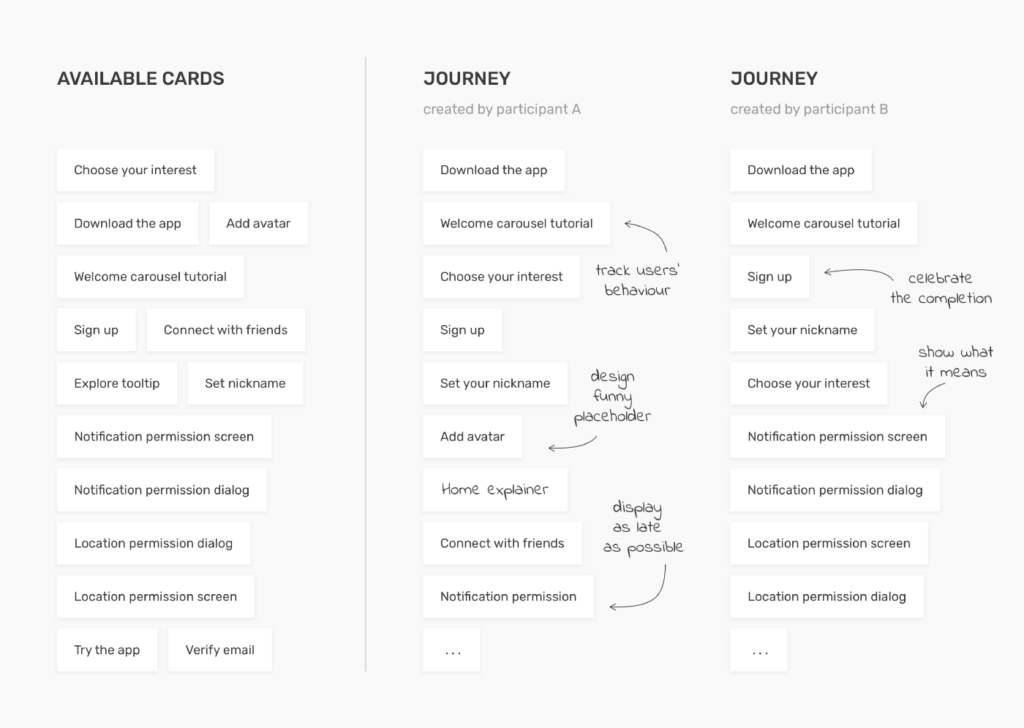
A good method to carry out this exercise is to cut out small notes with the steps that currently exist in the process. This will allow participants to sort out, arrange, and move these little cards until they are satisfied with their solution. After 8–12 minutes, let them present the journey and explain their way of thinking.
Finally, it is time to establish one version of the FTUX journey. Use the board to write it down. Analyze each step together to determine which one is essential for the flow and which may be part of the second or third session. The goal is to nail the experience, eliminate friction and add some delight.
👉 Tip: Try to find some improvement in your steps. You can use the “How Might We” formula to brainstorm on new ideas.
Wrap-up
20 min | any to-do list software (Jira, Trello or just notes)
An integral part of a meeting should be the next steps. Look at the outcome of your work and plan some actions. Most of them will probably be assigned to the designer. However, you might come up with several actions like improving the copy or preparing requirements for tracking user behaviour. For example, we set an action to explore possibilities of content creation and to conduct an illustration workshop.
You all did your best and created a killer experience. What if this is not enough to meet user expectations? Don’t be afraid of failure. Getting the onboarding flow right will take time and experimentation. Once you have your challenges identified, you can plan user testing or data analysis where you will be able to check your hypothesis. If you have more time, plan long-term actions as well.
👉 Tip: Assign the actions to a specific person and set the deadline. Responsibility and motivation are essential to moving things forward.
Our results from the FTUX workshop
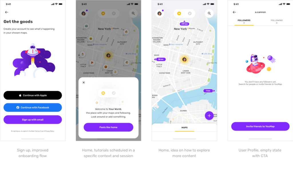
Back to our story, the workshop helped us agree on the values we wanted to promote, simplify the onboarding flow, and plan the first few app sessions. Obviously, we could not come up with a solution that resolved all the issues that I was initially concerned about, but we better understood and defined them together. The workshop made it easier for us to address them in the future.
Below you will find several designs that are included in our FTUX journey and have been improved thanks to the workshop and my amazing teammates 🤗
Takeaways
If you are the type of person who starts reading from the end, here are a few key things about the First Time Users Experience Workshop:
- The workshop aims to apply the common onboarding principles to your product and create the FTUX strategy.
- The prep work should start with listing all concerns, which allows you to adjust the workshop to your own needs.
- It is inspired by Design Thinking methodology and is based on three parts: Empathise, Define and Create.
- In the last part, you will create the FTUX journey, which ends up with a defined “Aha” moment.
- It is recommended to summarise the workshop and plan specific actions for next steps.
That is it. I hope you found something inspiring in this little workshop plan. Let me know when you try it with your team - I’m very curious about how you approach the FTUX in your product. Have the best first times ever! ✌️
Why is the First-Time User Experience so important?
First-Time User experience is significant as it determines whether the user will want to continue using the product or not. We are all well aware of the importance of first impressions and how they can affect our feelings about a product or service. No wonder - every customer wants to feel that a product fully meets their needs. All the more so given that there are many competitors on the market today ready to do anything to satisfy a potential user. Therefore, first contact with a product or brand is essential. A positive experience can encourage them to explore the product's benefits further, while a negative one will likely derail further interactions with your service forever. The rule is simple: the better the First-Time User Experience, the more likely users will continue their journey with your digital product. Just think, a potential customer has gone down that long path from not knowing your brand exists to, for example, installing an app only to give up through a poorly designed registration process. Isn't it better to avoid such situations?
What are the First-Time User Experience metrics?
Four basic metrics will allow you to measure First-Time User Experience:
1. Satisfaction Level
User experience strongly influences satisfaction or lack thereof. You can measure satisfaction levels using various methods, such as the Net Promoter Score (NPS) or social media surveys.
2. Retention Rate
The retention rate indicates if and how often users return to your app over a certain period of time. A low retention rate may indicate that users are not fully satisfied with the digital product.
3. Conversion Rate
Conversion rate indicates the number of users who take the most desired action, e.g., finalising a payment. As a result of poor user experience, the conversion rate may drop significantly.
4. Average task time
This metric shows how long it takes for users to complete a specific action. Should the registration or payment process be shorter? This may indicate the need to improve the user experience.
What are the examples of the First-Time User Experience?
First-Time User Experience is the user's first interaction with your product. Depending on the type of your digital solution, it can involve many different things, such as a beginner's tutorial in the application, the process of filling in data, or the registration process. It is, therefore, worth making these actions as convenient as possible for the user. Offer a shopping experience without the need to register, including the possibility of skipping the tutorial. These simple things can significantly enhance user satisfaction. That's why user experience is so crucial in the process of product development. You don't have to look far for examples. By adding the possibility to make purchases without registration, Lego increased its revenue by $300 million a year! It's worth going through the whole user path again and checking what areas of your product can be changed to improve the user experience. Sometimes, as in the case of Lego, even a tiny thing can make a huge difference.


