So you came up with an excellent idea for a digital product, spent long months designing and developing your innovative solution, and even tested it with real users. It seems like nothing could go wrong, right?
But then you launch your mobile app, hoping for massive success and… nothing. There’s no buzz around your product, conversions fall far short of expectations, and, even worse, almost no one installs it. How could this happen?
You need to remember that the current mobile market is filled with revolutionary and innovative solutions. You are not the only one vying for users’ attention, which makes it tough to stand out from the crowd.
That is exactly why in this article, I will walk you through the best strategies on how to get more app downloads, increase app user engagement and boost your mobile app conversion rates.
Let’s bring your app into the spotlight!
What is the mobile app conversion rate?
First, let’s get some definitions straight. The mobile app conversion rate can mean two completely different things in the mobile world. It may be calculated as:
- The total number of application downloads from different app stores (also known as app store conversion rate),
- The total number of completing desired in-app actions such as making in-app purchases, subscribing or viewing content.
The mobile app conversion rate is one of the key metrics determining which user acquisition channel performs most effectively, giving a general overview of how end-users interact with it. So if you’re wondering how your app performs in app stores, then the mobile app conversion rate is what you need to find out.
How to calculate the mobile app conversion rate
Calculating your mobile app’s conversion rate is quite simple. Depending on which of the two definitions you follow, it can be measured in two different ways:
1. App store conversion rate
Here, you take the total number of users who downloaded your app from app stores (like Google Play or iOS Play Store) and divide it by the total number of exposures, i.e. impressions of your app’s product page or App Store listing.

For example, if 1000 mobile users viewed your app on Google Play and 40 downloaded it, your app store conversion rate is 4%. It’s as simple as that.
2. In-app conversion rate
The in-app conversion rate is calculated similarly. However, here you need to determine the most desired action you want users to take in your mobile application. If you’re running an e-commerce app, you probably need to calculate the number of mobile app purchases. For a travel app, you should consider bookings; for a fintech app – the number of transactions would be a safe bet.

Whatever it is, you should take the total number of actions completed and divide it by the number of active users. This way, you receive the in-app conversion rate.
Get more app installs with these 8 strategies!
Now that you know what mobile app conversion rate is and how to calculate it correctly, I will introduce you to the best strategies to improve this powerful metric.
Let’s cut to the chase!
1. Optimise for app store searches
First and foremost, if you want to boost your conversion rate and get more app downloads in no time, you need to start by optimising your product’s App Store Page (ASO).
Why is this strategy so crucial? For one simple reason: the app store is the first place where users search for mobile apps and eventually install them. In fact, 47% of iOS users and 53% of Android users discover new apps by browsing app stores. It leads to one conclusion: if your product is not visible there, you lose the opportunity for more downloads. In turn, your competitors gain new customers just because their product is properly exposed and easy to find in app stores.
App stores use entirely different algorithms to set rankings for digital products. However, if you want to improve your visibility, you need to follow a couple of rules that are common to most app stores:
- Use prominent keywords in your mobile app’s name.
- Include these keywords in the app description as well.
- Determine the relevant primary and secondary categories that most accurately describe your application.
- Localise your content.
- Add visual content (app icon, images, videos, screenshots) to your app’s page.
ASO is a great way to increase organic app downloads, cut acquisition costs and easily reach highly relevant global users. So if you’re noticing an alarmingly low mobile app conversion rate, start by optimising your app’s page, and you’ll see the difference in no time.
2. Support localisation
Localisation allows you to better tailor your app to users from different countries, living in different cultures and speaking different languages.
Just think about it: even if you develop your app in English (which seems like an obvious choice, since the language is spoken by over a billion people worldwide), it still fails to reach all your potential users. What if someone doesn’t speak English or prefers to use digital solutions in their native language? That’s where localisation comes into play.
And no, you don’t have to localise all elements at once. Instead, you can start by translating the most crucial elements of your app’s page like app description, keywords or screenshots. This approach is called Minimum Viable Localisation (MVL) and works well for those who are just about to enter foreign non-English speaking markets.
One question remains: into which languages should you translate your app’s page? Here, you need to take into account two major factors:
- The number of speakers: German, French or Spanish languages have a much greater potential to bring new users than, say, Estonian or Icelandic.
- Market competitiveness: fill the gap in less competitive markets with few strong players.
3. Leverage culturalisation
Want to take your app localisation to the next level? Bring some cultural elements to your messages and tailor them to different regions. After all, users in certain countries may interact differently with your digital solution and have entirely different expectations.
Look at the example of Spotify. To bring a cultural element to each audience, they use one simple trick – in the screenshots of their app, they present the most popular artists in each country. That’s why the Polish audience will see Sanah, and Italians will be ensured to find the latest tracks by BLANCO.

Culturisation makes your messages more relevant and meaningful to a given audience, and, as a result, they will interact with your mobile app more willingly.
However, when stepping into culturalisation, you need to be very careful. Do thorough research first to discover even the slightest nuances of each culture to avoid accidentally offending anyone.
4. Implement different strategies for iOS and Android
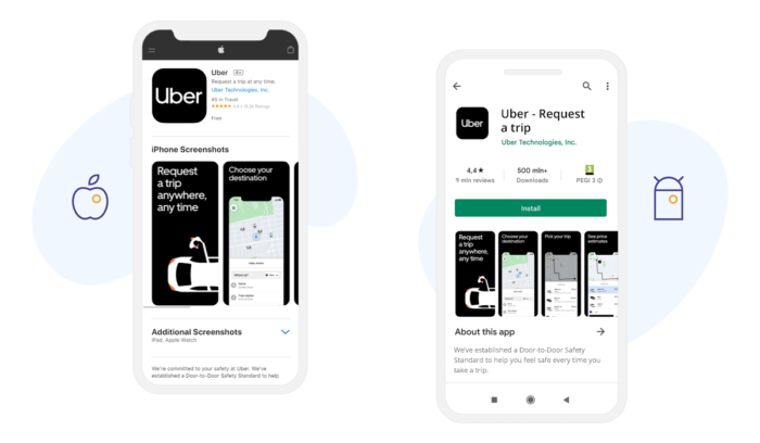
Want to reach both iOS or Android users? That’s perfect! This way, you increase your chances to get more downloads. However, keep in mind that different app stores require entirely different strategies. If your app performs well in Google Play, it doesn’t necessarily mean that it will make it to the top in the iOS App Store.
The main differences between Google Play and the iOS App Store come down to:
- Competitiveness: There are 2.87 million apps available for download on the Google App Store, while on the iOS App Store, you’ll find almost a million fewer. It leads to one conclusion: positioning your app in the Android store can be far more challenging and time-consuming.
- Stores policy: iOS App Store has more restrictive requirements that’s why many applications are rejected. What’s more, Apple charges for maintaining an app, while at Google Play Store, you are required only to pay the registration fee.
- App’s page design: The layout of both app stores varies, especially when it comes to image resolutions, location of screenshot gallery or First Impression Frame. That’s why when optimising your product page, you need to emphasise different content elements in each store.
- User behaviour: Users in Google Play are considerably more decisive – they will more likely download your app seeing only First Impression Frame. So to boost your app’s conversion rate, you need to optimise the first impression because, with Android users, you have about 3 seconds to convince them to install your app.

Want to know which operating system to choose for your next project? Read our comparison of iOS and Android and make the right decision!
5. Get more app reviews and ratings
Have you ever heard about social proof? This psychological and social phenomenon proves that uncertain people are more likely to copy and follow others to make the right decision.
You probably check reviews when looking for a hotel in Greece or ordering sushi, for example. The same goes for app ratings and reviews. Lots of positive feedback in app stores is a form of social proof that will encourage new users to download your app.
Without a doubt, app ratings are one of the most powerful marketing tools you have in the app stores. Yet, many application owners tend to ignore them – currently, 44% of apps on Google Play and 57% on the iOS App Store have no ratings. Be one of the 56% of apps on Google Play that cares enough to get user feedback. This way, you will easily gain a competitive edge.

What’s important, as I have already mentioned, is that app ratings and reviews have an immense impact on ASO. So by receiving user feedback, you may also climb up in the search results. And that’s exactly what you need to boost your app conversion rate.
6. Use captivating visuals
As the old saying goes, don’t judge a book by its cover. But whether you want it or not, users tend to judge applications based on their design and visual presentation in app stores. With that in mind, you need to not only provide an enchanting app design but also add two extra layers to your product page:
Videos
Videos in app stores give a perfect opportunity to showcase your product and provide a sneak peek of what your app offers.
It’s important to note that in the iOS App Store, videos display automatically once users enter the product page, which grabs their attention immediately. I probably don’t need to convince you how strongly this impacts their decisive process.
How do you create a video that speaks to users? Follow these simple rules:
- Make the video short and sweet
- Present your unique value proposition at the very beginning of the video
- Add subtitles and other textual elements
- Use killer call-to-action messages
Screenshots
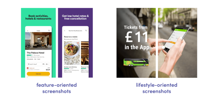
Your app screenshots are one of the most impactful elements on a product page, which highly influence the decision-making process. Choose only top-notch visually pleasing screenshots that clearly demonstrate your unique value proposition. Here, you have two main screenshot strategies:
- Feature-oriented screenshots: your app screenshots presenting the most important set of features
- Lifestyle-oriented screenshots: show how people use the digital solution in the real world.

No matter which screenshots design strategy you choose, test it. Try different sets of screenshots and decide which one contributes to your average conversion rate.
7. Test changes frequently
Trends in the mobile app market are changing at a rapid pace. The same is true for the app marketplace. Actions, images, content or CTAs that produced excellent results a month ago may no longer be as effective today. Therefore, keeping up with trends and adapting app information to user needs is essential. However, various requirements for how an app is displayed or searched can change over time. In such cases, previously prepared content may no longer comply with the latest requirements.
If your previous optimisation efforts are no longer producing such great results, it is worth checking if:
- Updates to the search or display algorithms were introduced.
- Requirements for images, video or content length have changed.
- The application’s technical performance requirements remain the same.
- Everything is displayed correctly.
If none of the above has happened, it is worth considering starting the whole path of increasing app conversion again. You may apply new, unique solutions to encourage users to download your app. As you can see, conversion rate optimisation is an ongoing process.
8. Take care of the content provided to the user
Many app owners tend to believe that user will download their apps immediately after their first interaction with the app store app. They couldn’t be more wrong. In fact, it is usually only the beginning of the user journey with your digital product. This is because app users need more time to decide or more information about the brand. In such a situation, the potential user may want to return to your app’s page in the marketplace over time. Your job, then, is to provide them with unique content so that they can learn more each time they visit your app’s page. If they see the same information over and over again, which, after all, didn’t encourage them to download the app before, they will feel that you can’t offer them anything more and won’t come back.
What can you do to prevent this?
- Try to include as much relevant information as possible, but do not overload the user with too much data.
- Create a variety of content – let text, screenshots or videos show different functionalities or possibilities of the application.
- Keep the content up-to-date.
- Show the potential user the real benefits of your app.
- Personalise the user experience if possible.
Improve your conversion rate to reach new heights!
Only by continuously optimising your product in app stores can you achieve your desired goals in the long run. So whenever you notice any disturbing drop in your mobile conversion rate, do a little investigation to find elements that need to be optimised. After all, there is always room for improvement when it comes to app performance!
Looking for a product strategy agency? Our experts will develop winning strategies for your digital solution!


