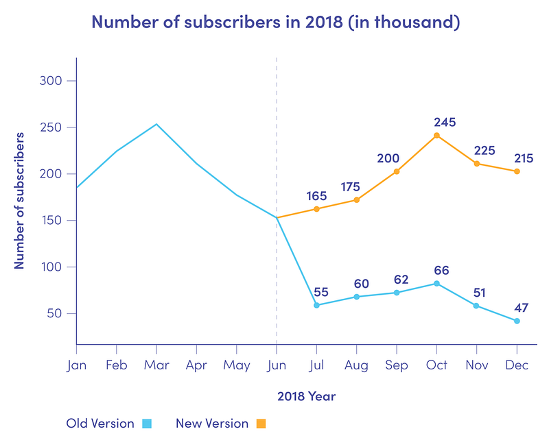
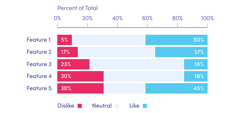
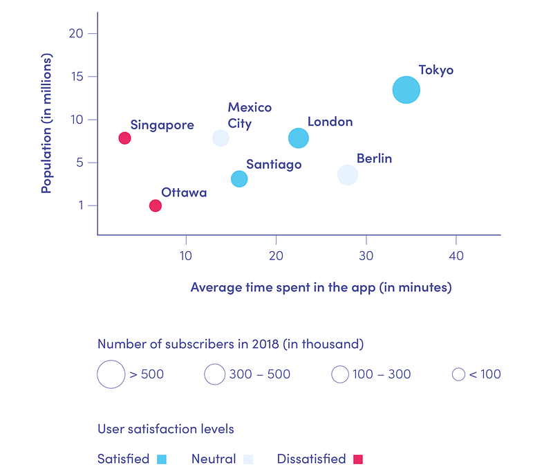
You might think that Data Science, due to its name and very close relationship with statistics and software development, is a purely technical field. But when we dig deeper into the applications of modern data analysis, we find that clear and fair presentation of the results of the analysis is almost as important as the analysis itself. Proper data visualisation requires not only technical skills and knowledge of some advanced chart types but also the ability to draw pictures and tell stories with data, which makes it kind of an ‘artistic’ part of Data Science.
Data visualisation plays a particularly important role in business, where data analysis is widely applied. The results of data modeling and analyses often influence the imagination of stakeholders and inspire their decisions, so it is crucial that they understand the results of the analyses properly. However, top management rarely has deep knowledge of predictive models and statistics (or time to dig into their mathematical details). Presenting data visually in a clear, comprehensive and engaging way can be of great help in their data-driven decision-making process. Data science services are therefore becoming increasingly popular. In this short article, we present a few tips on how to turn data into effective, thought-provoking stories.
Understand the business
In business, the job of Data Scientists is to help companies grow and solve their problems through data analysis. Data Science can have a great impact on strategic business decisions and the way companies evolve. This means that it is crucial that Data Scientists understand the industries they work in, and know their companies’ current goals. They need to know what the most critical problems are, and what practical means can be applied to solve them. This way, the attention of Data Scientists will always be focused most efficiently, and the results of their work will be applicable in practice.
Eliminate clutter
Putting too many visual elements on one graph can make it complicated and difficult to understand. If a graph is too confusing, you risk losing the attention of your audience, who will focus on ‘deciphering’ it instead of listening to the story you want to tell them. This way, instead of strengthening your message, it becomes blurred. Therefore, you should always think twice about what you want to put on your charts, and what the purpose of each item is. Make sure that every element of your presentation helps the audience read the message you want to tell them.

Focus attention where you want it
In order to focus your audience’s attention, it is important that you think about who they are, what their background is, and how they perceive the world. You would probably use different graphs for a very technical group of engineers, and for a group of middle school students in a classroom. You can use attributes like size, colour, shape, and position on the page to make the graph engaging and to draw your audience’s attention to the areas you want them to look at. It will help you guide them through your presentation the way you think is best. Don’t be afraid to deviate from some ’standard’ ways of presenting data, or to add extra elements like arrows, circles or even text boxes. If something can tell your data’s story, use it!

Think like a designer
While working on data visualisation, treat it like a product you want to sell to the audience. Think like a designer, and answer the question of how your audience is going to interact with your presentation. Is the layout clear? Is there anything in the graphs that might cause confusion? Are the subsequent charts logically ordered, creating an easy-to-follow presentation? On the other hand, are the audience going to ask questions about what they see, or just listen to your interpretation? Are they likely to comment or build on your work?

Data Visualisation: tell a story
Stories are magical. Use a story to communicate with your audience, and to engage them emotionally. Make your audience excited about the results you are going to present by giving them a hint of your results at the beginning of your presentation. But do not tell them everything at the beginning! Suspense is the key to grabbing and maintaining attention. So build on it and keep your audience wondering and excited about what is coming next.
Also, on a more practical note, think beforehand about what questions your audience might have when looking at your presentation, and incorporate the answers to these questions into your narrative. This way your story will be more complete, and your presentation will be less frequently interrupted.
Summary:
There is a hidden story in every dataset. How well you tell this story and how you inspire your audience to act on it depends only on you. Just remember to give extra attention to the way you graph the data in your stories, because “a picture is worth a thousand words“. Great stories inspire great ideas. Make sure your audience not only remembers what they have heard but also stay inspired by the wondrous magic of data visualisation.
References:
Cole Nussbaumer Knaflic, Storytelling with data. A data visualization guide for business professionals


