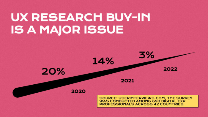
As a designer with over 7 years of experience, I am glad that UX research is finally becoming an integral part of the design process in most companies creating digital products for users. As the state of UX Research Report 2022 clearly shows, over 20% of researchers in 2020 claimed they have struggled with convincing stakeholders to run any user studies during their UX process, while in 2022, it was only 3%.
In my opinion, the era of begging for user studies has ended; however, in the coming years, we will have to deal with many improperly conducted research sessions with wrongly interpreted data due to a lack of proper education on how to run them.
To combat this issue, it’s essential to work with experienced professionals who can guide you through conducting effective user research. A UX audit service that can help identify areas for improvement in your current UX design and research practices. Our team of experts can provide tailored recommendations and solutions to help you optimise your user experience and avoid the pitfalls of improperly conducted research sessions.
Recently, I had the pleasure of giving a speech at the Mobile Trends Conference 2023, where I highlighted how cognitive biases impact the UX process of creating a product and how they might cause losing time and money. Read on for the key takeaways from my presentation.
What is cognitive bias, and how does it impact our thinking?
The brain’s innate ability to make decisions quickly can be seen as one of the major factors in making decisions in a particular situation. The shortcuts serve the purpose of accelerating brain processes. This helps us understand our experience quicker and make many daily decisions. Cognitive biases are mainly the result of systematic erroneous thinking.
Famous psychologists such as Daniel Kahneman and Amos Tversky were among the first to propose cognitive biases terms. Their findings demonstrated a common problem: people made judgements and choices which were not rationally correct. In fact, a growing number of cognitive biases have emerged from social psychology and behavioural economics. Typically, the cognitive biases examples come from ignorance or lack of information. Or, the underlying cause might have been the weighting of a minor but significant factual element about the particular situation.
What are cognitive biases in UX?
They are the behavioural or thinking patterns that people create to ease their cognitive load and quickly process an abundance of information. People use cognitive biases as mental shortcuts, making their decisions relatively easier to handle. However, these biases can often lead to flawed decision-making and inaccurate judgments.
Understanding and acknowledging these biases in UX design is crucial in creating effective user experiences that cater to user needs and preferences. Some common cognitive biases in UX design include confirmation bias, the tendency to seek out information that confirms pre-existing beliefs, and anchoring bias, which tends to rely too heavily on the first piece of information encountered.
By recognising and addressing these biases, UX designers can create interfaces that promote clear thinking and objective decision-making, ultimately leading to a more positive user experience. Below are examples of cognitive biases in UX with tips on avoiding them.
What are the most common cognitive biases?
Cognitive biases may vary and depend on our education and social or cultural context. Originally based on psychology, cognitive biases are frequently observed during the UX research process. Here are some most common examples:
1. Confirmation Bias
We tend to interpret information in a way that supports our beliefs. It means that when creating a user study scenario, researchers might build their questions to support their hypothesis, which impacts how users respond. Confirmation bias can lead to inaccurate and incomplete data, which can, in turn, affect the validity of the research findings. To avoid this bias, it’s important to remain impartial and open-minded during the research process and consider alternative hypotheses that may challenge the initial assumptions.
Example:
Suppose there is an e-commerce service where most users frequently add items to their cart without successfully finishing the purchase process. There is an assumption that the “checkout” button might not be visible enough. Therefore, in the usability study scenario, a designer asked the following question:
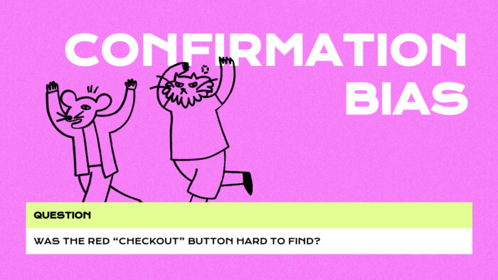
I assume you already noticed at least 2 mistakes in the above-presented sentence. Let’s take a look at a better alternative that is not tainted by confirmation bias:
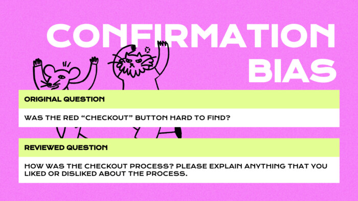
Why? Because the question suggested that there is an issue with the purchase process, which immediately framed the user into a specific pattern; secondly, this is a closed-end question which wouldn’t verify what actually happens in the process, and finally, the question focuses on the specific component which, on the contrary to our assumption, might not be the clue of a problem.
How can you mitigate the risk of implementing this bias in the usability test scenario?
So to reduce the risk of implementing this bias in the usability test scenario, you should:
1. Avoid asking suggestive questions, which frame the user’s way of thinking and perceiving in-app experience.
2. Avoid asking closed-end questions on which the user can answer yes or no. The goal is to find out why the issue occurs.
3. Do not build questions based on your hypothesis; the issue you are looking for might not be the one you identified.
2. False Consensus Bias
The tendency to see our own behavioural choices and judgments as relatively common makes us think that everybody thinks the same way we do. False consensus bias can lead to assumptions about users not representative of the population. To avoid this bias, UX researchers should strive to obtain a diverse sample of participants to gain a more comprehensive understanding of users’ behaviours and preferences. Additionally, researchers should remain aware of their own biases and assumptions and actively work on challenging them throughout the research process.
Example:
Few years ago, I happened to work on a pregnancy tracker app, which was and still is a very popular app for future moms. Due to that success, our team decided to create an app for dads so that a couple expecting their child could track the pregnancy together.
We didn’t have much money for the user studies and research so we decided to run guerilla testing among people in our company. We asked them how they would imagine a pregnancy app for dads and collected very valuable feedback.
We made some assumptions about our potential target group:
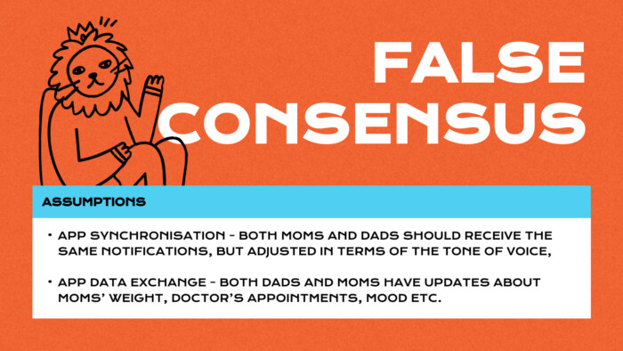
Soon after the app’s release, we, unfortunately, realised that what we agreed to during the product development had no confirmation in reality. This is what we found out:
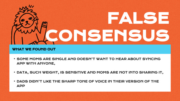
What should you do to prevent false consensus bias?
- Focus on your real target group, not the “whole world”. Trust me, even though your app is designed for a vast audience, it is still divided into particular groups with particular needs and motivations.
- Question your own decisions, always! We all live in our own information bubbles, and the researcher should gather information from the outside.
- Look at what users do, don’t listen to what they have to say. People lie. They might be intimidated by the researcher’s presence; they want to make an impression on others and declare to do something they are not doing. Therefore it is smarter to ask about their habits and observe their actions rather than listen to their opinions.
3. Framing Biased thinking
People decide on options based on whether they are presented with positive or negative connotations. When asking them suggestive questions, it is easy to frame a user during the study.
Think about a service that helps amateur cooks look for delicious and healthy meal recipes. The design team wants to determine if the search features work without distractions. After all usability sessions, there is a conclusion, which was started in two different ways:
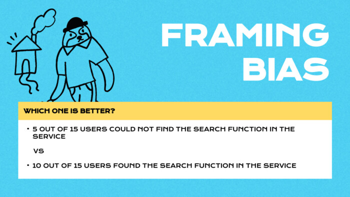
We all agree that this is the same data, but how it is presented impacts business decisions differently. So how should we present such data? I think there is no good answer to this question. In my opinion, being objective researchers, we should present both data and discuss it with the team. The team should verify the importance of this feature, implementation cost and the context – there may be a need to verify these findings with quantity data, such as analytics.
How to deal with framing bias?
- Triangulation, which is the method of using multiple data sources in qualitative research, helps to develop a comprehensive and broad understanding of the context of the issue, its scale, and its importance.
- Present your findings both ways, depending on the importance and priority. Discuss it with your team or other researchers.
- Keep an eye on how the data is presented; it might greatly impact stakeholders and how they perceive their product.
There are also two frequent biases which I have decided to describe shortly below.
4. Negativity Bias
A tendency to emphasise experiences of a more negative nature over neutral or positive things. It means that once a user goes through the product smoothly – they would consider it a standard experience. `They would rather focus on some struggles rather than positive or quick actions, which might cause the researcher to focus on the negative outcome of the study. Moreover, negativity bias can result in an unbalanced view of user experience, where negative aspects are given more weight than positive ones. A comprehensive understanding of users’ experiences, both positive and negative, and an aim to address any pain points or challenges identified during the research process to create a more well-rounded and positive user experience is crucial in overcoming cognitive biases.
5. Availability Bias
The tendency to rely on immediate examples that come to a given person’s mind when evaluating a specific topic, concept, method, or decision. This means that once the decision has been made, it is usually based on data that hasn’t been researched in detail.
Availability bias can lead to a narrow and incomplete understanding of the topic, as necessary and relevant information may be overlooked or excluded. To avoid this bias, it’s essential to gather a broad range of data and information from various sources and remain open-minded and objective during decision-making.
Why should product and UX teams care about cognitive biases influence?
As product creators, we should hold an objective mindset to identify users’ true needs, understand their behaviour and bring unbiased data to build product goals and requirements. Building products on false data or assumptions without evidence might cause the business serious damage.
What are the risks of mental shortcuts in creating a product?
Building product requirements based on biased research might lead us to:
- Incorrect conclusions which won’t represent the true user and business needs
- Focusing on the wrong problem or developing a useless feature
- Prioritising issues that don’t reflect the real market or usability value
- Implementing features that don’t bring any benefit to users and businesses eventually will cause a loss of time and money
How to overcome cognitive bias in UX research and usability testing
First of all, engage more than one person in the UX Research process so that they can exchange their observations and increase the possibility of delivering unbiased research conclusions. However, I recommend running the interpreting session with more or less 5 researchers to increase your objectivity chances.
Secondly, value what users do rather than what they say, based on observations and asking about their habits, not opinions.
Thirdly, use some statistics to complete the quantity data so that you can be sure you have a piece of evidence for certain conclusions.
In the end – focus on the goal of the research and define metrics that will prove this goal rather than your own – it will keep you focused on the purpose of the study.


