So you’re thinking about redesigning your app. There’s nothing unusual about that - most product owners opt for a radical makeover sooner or later. After all, redesign is the best way to adapt to the market's evolving standards.
Are you wondering what this process looks like up close? We've prepared a step-by-step guide together with a redesign case study to satisfy your curiosity. Keep reading to find out:
- What redesign is;
- Which famous brands have successfully undergone this process;
- How your business can benefit from redesign;
- In what cases it is wise to turn to it;
- How to redesign an app step by step - Miquido’s case study.
Let’s jump right in!
What is redesign?
Redesign refers to the changes made to visual identification or architecture of a product. The goal is to make it more updated, functional, and in-line with the most recent design trends. In some cases, redesign is a part of a rebranding strategy that aims to modify a brand's image in general. However, you can also redesign particular elements of the product or the brand’s visual identity, such as logo, app design, etc., separately.
UI vs UX in redesign
Sometimes, it's all about the looks. In these cases, designers usually try to implement new trends in the project without compromising the brand's voice and unique character.
There’s also a chance that it’s the app's architecture and the overall flow that require some lifting. Just as for User Interface, people’s preferences for user experience are shaped by the dominant trends in the industry. When other apps introduce solutions that improve performance and intuitiveness, users get used to them very quickly.
That's why redesign can be essential for brands that want to grow fast - it allows for keeping up with the clients' evolving needs and habits and stops them from migrating to other products.
The most efficient way to approach redesign would usually be to work on user interface and user experience simultaneously. However, this is not always the case. And if you’re not sure whether your product needs help with the visuals or if it’s the entire customer journey that you’d like to modernise - reach out to professionals for a quick free consultation.
Want to discover the main differences between UX and UI design? Check our detailed comparison!
Successful examples of redesign campaigns
Surely, you know at least a couple of global brands that have changed over the years. The Internet is full of such examples. Globally known apps go through a subtle facelift aiming at improving the user experience rather often. However, let’s focus on frequently discussed examples.

Instagram’s most memorable redesign dates back to 2016, when the brand introduced a new logo. It still represents a camera but in a much simpler form. Instagram has also simplified its interface by removing the colorful background. This way, it became even easier to focus on the content. The trend of minimalism is still prospering on the market today.
G-suite
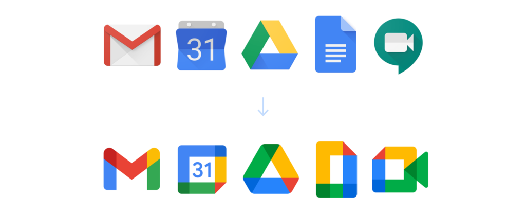
G-suite, during its latest redesign, has turned into Google Workspace. The Google team has introduced UX/UI improvement, making the apps seem lighter and more approachable by increasing white space. The most commented part of the redesign was, undoubtedly, the change of the icons. This change has caused mixed reactions - some existing users consider the new design confusing (check this analysis by TechCrunch for more info).
Uber

Uber is a real record-holder when it comes to rebranding. Over one decade, the brand has changed its logo five times! The last version signifies a new chapter in Uber's history, cutting it off from all the recent scandals. A particularly important change has touched the app’s UX, which now offers integrated access to Uber Drive and Uber Eats and saves users’ time and device memory.
The examples don’t end here, for there are many more other companies successfully benefiting from their rebranding efforts. However, we must move on to a much more pressing issue: what’s in it for you and your business?
How do you know when it’s time to redesign your app?
When working on their product designs, some brands put a strong emphasis on timelessness. We can risk saying that this word doesn't really exist in UX designer vocabularies. Every design has an expiration date. There are, however, certain things that stay true with time. One of them being some obvious advantages a good redesign strategy can bring.
Unquestionable benefits of redesign for business owners
If all the signs suggest that it's time to refresh your logo or application - it probably is. The market is subject to constant transformation - design canons evolve, users change their aesthetic preferences, expectations, needs, and habits.
Here are some of the basic benefits of redesigning your business you cannot overlook while building your digital product strategy:
| increased intuitiveness | increased revenue |
| improved performance | reduced costs |
| eye-catching, modern looks | higher mobile app conversion rates |
| more cohesive brand image |
Does this mean you should jump into the redesign process headfirst even if your business seems to be doing just fine? Of course not! Remember, the first rule of a good design is:
It’s not how it looks or feels. It’s how it works.
And, in order to make the right decision, you first need to understand whether everything is working the way you intended it to.
Signs you should redesign your app ASAP
There are some specific red flags that indicate you should consider redesigning. We've gathered the most common ones:
Negative feedback

Don’t be afraid of checking what people have to say about your brand. If you keep receiving bad reviews, something is definitely up. Looking through user feedback gives you a bigger picture of the existing problems and helps create the right solutions.
Poor conversion rate
The fact that users are not converting on a specified goal may originate in the complicated interface or architecture that does not match their needs. Improving UI & UX can lift the conversion rate and translate into profit.

Ongoing rebranding

Changing the visual identity of a brand and its tone of voice enforces the evolution of your product. Otherwise, there might be some inconsistencies in its image.
Expansion prospects
To keep ahead of the competition, you should make sure that both the UX & UI of your app is refined in every detail. This way, penetrating a new market will be easier and the overall impact of your product will be more significant.

Ok, but how should you approach the redesign process to end up with the most satisfying results? We thought we’d spare you a Wiki-how approach and instead provide our very own case study. This way, you’ll know which parts of the process matter the most in real life and what you can hope to achieve.
A transportation app redesign case study: Miquido perspective
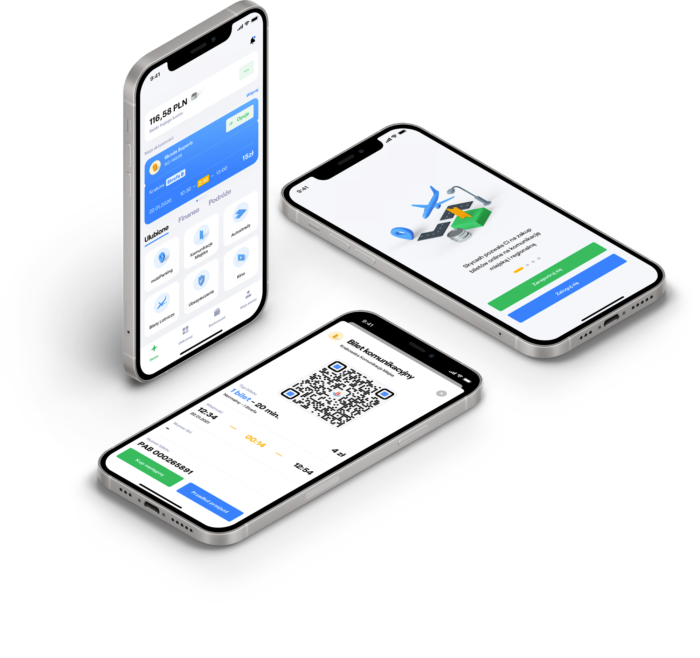
As the subject of this case study, we've chosen a popular transportation app that enables mobile payments for public transport and parking. However, it’s not about the brand names - it’s about the process, so we’ll be keeping things neutral. Our research is focused on universal aspects of the process, explaining how they contribute to the final effect.
And remember - you don’t have to go through the whole redesign process alone! Leave it to us - Miquido design team will be more than happy to navigate you through the whole redesign journey without any setbacks.
It can all be reduced to 5 simple steps, and we’re going to cover them one by one:

Step 1: Listen to the world around you
First of all, in order to provide a useful product, you’ll have to be aware of the latest updates in your industry and the most contemporary solutions that exist on the market. This will require some deep research on your end, including, yet not limited to, regular monitoring of Google Trends and the latest news regarding your industry.
When it comes to public transportation, we’ve established the following as the dominating tendencies:
- The increased popularity of digital tickets: they're considered to be more convenient, but also better for the environment.
- Growing demand for third-party apps supporting ticket purchase: according to the research from 2020, users tend to use apps that support buying the tickets, as they make the process faster and easier.
- Popularisation of QR codes: according to a GSMA report, payments with QR codes are becoming increasingly common.
Step 2: Carry out a competition analysis
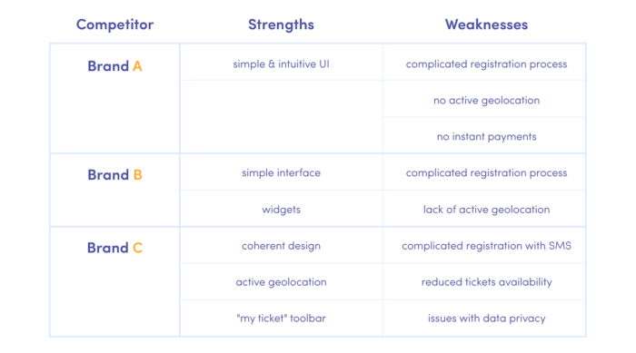
Compare the solutions implemented by your competitors and verify how the users interact. There are various online tools you can use for this purpose, like SEMRush or BuzzSumo. By using them, you can gather user insights and see which ideas work and what draws people away. Add your own twist to the proven solutions or try to come up with some innovations that none of your competitors has considered so far.
In the case of our transportation app, conducting a SWOT analysis led us to the following conclusions:
Step 3: Empathise with your target audience
After getting familiar with the general situation on the market through a research and competition analysis, it's time for defining user problems & challenges within the particular app.
As we specified earlier - user opinions matter. So now it’s time for you to understand what will make them happy and how to do it in the most efficient way possible. Draw empathy and customer journey maps, organise focus groups, interviews and surveys, browse through Quora, Reddit, and other ready-made sources of priceless information on what kind of a solution people are actually looking for. It will make your job to satisfy them much easier in the end.
Following from our analysis for the transportation app redesign, the most common issues users face include:
- A confusing purchase process: including issues like the lack of instant payments, multi-step buying process, unintuitive app navigation.
- Problematic data privacy: there’s a general discontent with applications that request broad access to user personal data without explaining the purposes.
- Exclusion of non-locals: transportation apps are usually designed by locals for locals, so naturally they tend to overlook the needs of everyone else. This means that such apps lose a large group of potential users by discouraging tourists and expats from using them.
Step 4: Understand how your solution can help
Now that you know exactly what the industry has to offer, how your competition is operating, and what your users are looking for, it’s time to provide them with a solution that will address their needs in the most efficient and modern way possible.
For our transportation app, we established the following ideas for improvement:
- Registration: cutting the whole registration process down to two steps in order to keep people engaged by making it less bothersome.
- Payments: simplifying the experience by introducing instant payments with PayPal, Apple Pay, or GPay; replacing the timer with a progress bar.
- Data privacy: including explanations on data usage and making sure the app only requests it when necessary.
Step 5: Test like there is no tomorrow
Releasing a final product without passing through a testing phase is risky and may result in financial losses. This stage of digital product design (and redesign) is perfect for eliminating bugs and rejecting the solutions that don't really work. Some ideas only look good on paper! So test, test, and when everything seems to be ready - test some more, just to be sure.
Quick wins for an even better redesign campaign
As you can see, a lot can be achieved with the right team, the proper technology solution, and some determination. The example above should have given you an idea of what the redesign process can look like.
Sometimes the smallest improvements make the biggest difference. So here are some fool-proof ideas you could implement in no time and with little effort:
- Simplifying the interface: let some white space in and make it easier for the user to focus on the content.
- Introducing a dark mode: this is a perfect solution for those who often use public transport in the late hours or travel underground.
- Active geolocation: this tiny addition to your existing functionality helps to avoid the mistake of buying a ticket in the wrong place and provides users with a greater sense of safety.
Go ahead and test it yourself! Or, if you're looking for qualified support with redesigning your product, reach out to our UX agency!
What is the cost of app redesign?
The cost of redesigning an app in 2023 could range from $5,000 to as much as $50,000. The price will depend on the complexity of the redesign but also the size of the team, the location of the company, or the technology chosen. Considering that a good app redesign can increase our revenue several times over, this investment does not seem like such a high cost. As you can see, user experience is one of the essential aspects of the application development process.
How long does it take to redesign an app?
The redesign time of an application depends on how much needs to be changed. If the app has few features and is not very advanced, a redesign can take 1-2 months. The more features, the more the redesign time increases, amounting to as much as 6-9 months for larger apps. It is, therefore, a highly individual matter, and much depends on the change that needs to be made. Sometimes, in redesigning an application, a few changes can make a significant difference, and sometimes the entire application's design must be created from scratch.
When should I redesign my app?
Factors such as negative feedback, poor customer retention rate, spatial design, and poor conversion rateare clear signs that it is time for an app redesign. Unfortunately, a negative user experience can strongly affect the success of an app, which is why, in addition to redesigning the app, it is always worth ensuring a good First Time User Experience. However, there are also several other external factors. One of these is a change in the software manufacturer's application-related guidelines. This often occurs when the system version is upgraded to a newer version. Also, redesign may be necessary if the application is transferred to devices with a different operating system. Another aspect that is a factor for redesign may be the rebranding of the company. Some experts also believe that every application should undergo a redesign once every 2-3 years in order to adapt to the latest trends.

